

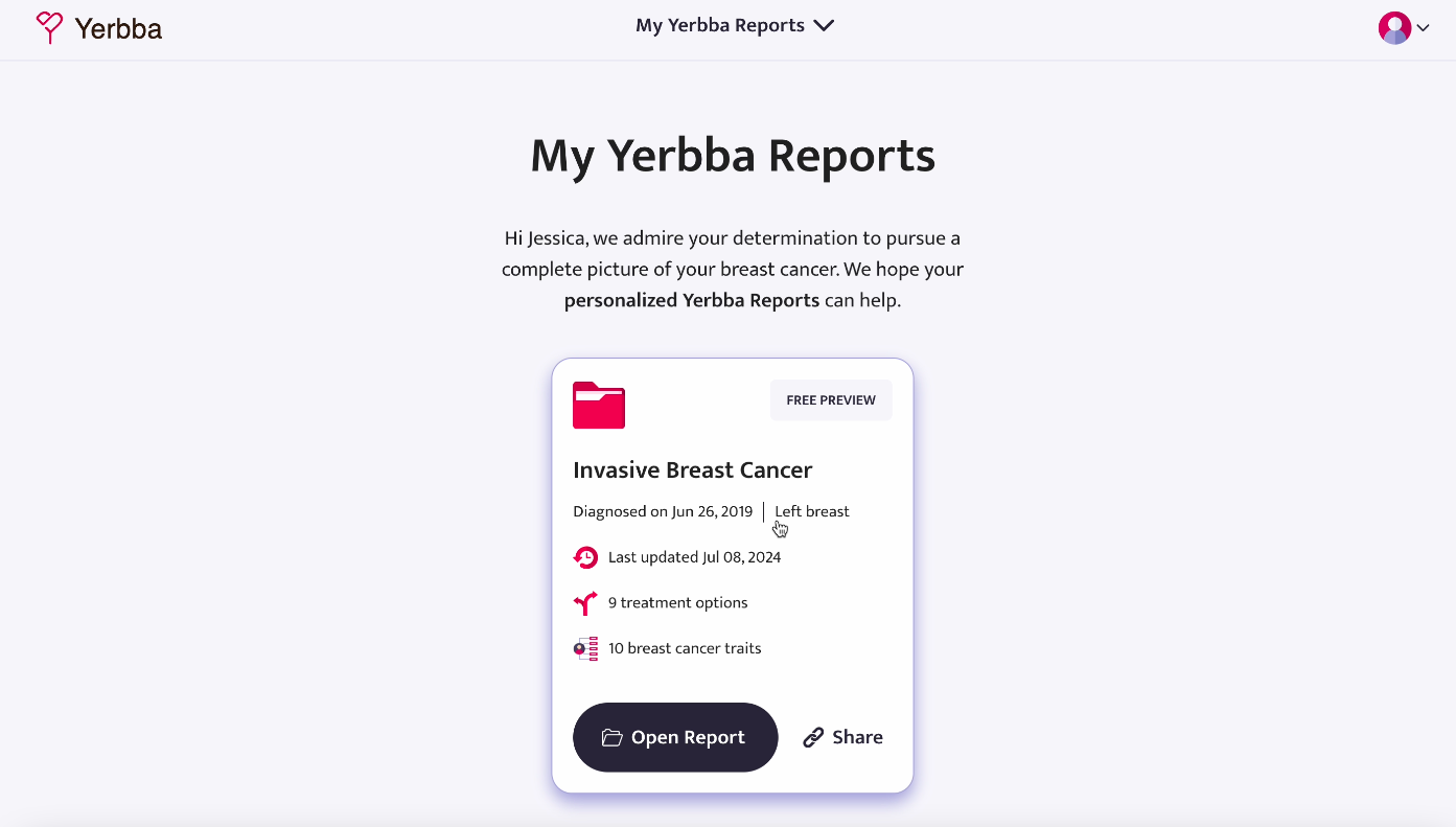
The Yerbba Report
Empowering breast cancer patients to make educated decisions by transforming their medical records into a personazlized report
@Yerbba, Jan 2023 - Feb 2024


mission

Redesign and build a Yerbba Report that Breast Cancer patients will buy and use

Assess the UX of the old Yerbba Report for untapped value
Research the needs of breast cancer patients to determine what they value enough to pay for
Iterate and test designs to produce a high-fidelity prototype

Build and launch the Yerbba Report
My Role
Sole researcher. Plan and conduct usability tests and user interviews. Explore product-market fit of big-picture ideas. Build test-ready, dynamic prototypes.
Sole designer. Sketch ideas. Wireframe leading candidates. Present designs. Create design system. Take product from lo-fi to hi-fi.
Sole front-end developer. Determine back-end requirements. Convert designs into pixel-perfect code. Adjust design details on the fly as needed.
Stakeholders
Uniting a multi-disciplinary team
While we had help from a couple of interns and contractors along the way, the core team consisted of four people: CEO, doctor, marketer, and myself. With limited resources, I needed to create synergy between myself and my team so that we could become greater than the sum of our parts.
CEO/Founder ~ Beltran Figuera

Back-End Developer, Business Ops, Strategy, Product Manager

I presented designs at our daily meeting to get feedback on how it fits the business vision and how feasible it is on the back end
I advocated for our users in import business decisions
I gave him back-end requirements for each feature during the development process

Ideas in Figma to discuss at our daily meeting
Oncologist ~ Dr. Jennifer Griggs
Influencer, Patient Advocate, Medical Consultant
I conducted a series of stakeholder interviews with her in order to:
a) clarify key concepts in breast cancer treatment as questions arose during design iteration
b) elicit strategies for how to break down complex information to patients
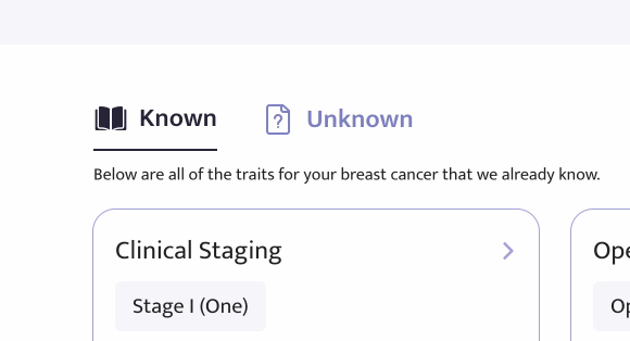
Tabs in the “Cancer Traits” page that were inspired by how Jennifer breaks information down to her patients
Marketer ~ Gigi Pickney
YouTube Producer, Landing Page Designer, Marketing Data & Strategy
I provided her with up-to-date screenshots and clips to use for marketing materials
I clarified features of the report to align marketing and product

Gigi and I worked together on the Landing Site to make sure it aligned with the features of the Yerbba Report
Competitors
Defining a novel solution
We assumed that we were building a novel product. But I wanted to make sure that we really were providing something new. So I did some digging, looking for any products related to breast cancer information and I noticed each of the existing methods for getting information had a critical hole.


Constraints
A solo designer tackling a large project with complex problems
Redesigning the Yerbba Report required me to work through several unique constraints, imposed both by the stage of Yerbba as a company and the industry we sought to provide value in.
Recruiting breast cancer patients

We didn’t have the time, money, or existing user base to recruit breast cancer patients for research
I used UserBrain’s large pool of testers to get asynchronous recordings from breast cancer patients in one day
Breast Cancer Knowledge
It’s difficult to work through product ideas on the treatment of breast cancer when you’re not an expert. It’s especially difficult when you know next-to-nothing.
I read a book called “Radical: The Science, Culture, and History of Breast Cancer in America”, which helped me identify gaps in the patient experience.
I conducted a series of stakeholder interviews with our oncologist, which helped me model the patient/doctor relationship.
Working with what we have on the back-end
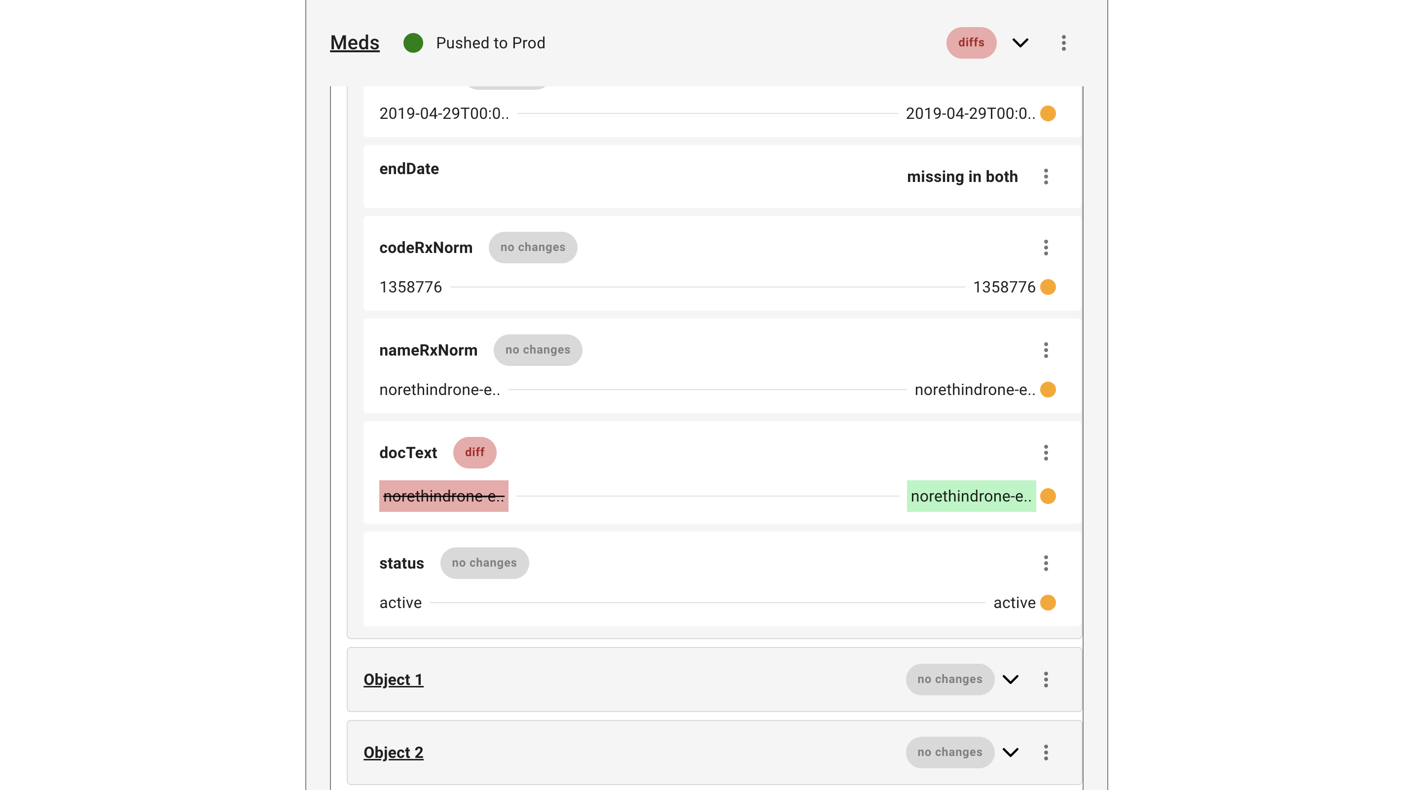
Any changes to the pre-existing system that parsed medical records and provided data to the front-end were complex and time-consuming.
I largely focused on detecting untapped sources of value in the old Yerbba Report, and then making those things more discoverable and understandable.
Creating a fully responsive product
Since we didn’t have a mobile app and our users may be accessing their report on their way to a doctor’s appointment, the experience needed to be fully responsive for all screen sizes
I found that designing for mobile first was more effective, because it was easier to expand a design from less space to more space than to condense it from more space to less space
I meticulously created a web and mobile version for each design and documented any differences that would need to be coded
Threading the Legal Needle
It was crucial that our product was not interpreted as an official provider of medical services or advice.
I framed the experience as a personalized accumulation of publicly available information, rather than as an AI second opinion.
I worked with our CEO to craft a series of language guidelines, which replaced phrases like “Ask a doctor” to “Ask a Yerbba Expert” and “necessity” to “likelihood”. (Pictured Below)
I created disclaimers barricading the more legally sensitive parts of the report, for added security
Preliminary Research
Assessing the old Yerbba Report and the people who may use it
The “old” Yerbba Report existed as a proof-of-concept for the back-end. To prove that you could connect to a patient’s EHR provider, extract information from their medical records, and produce a personalized report. But not much thought had been given to the actual experience of said report. Or the people who were to use it.

Home page of the old Yerbba Report
Round 1
Inviting friends and family with cancer experience for live interviews and usability testing
- 5 Participants
- Live
- Interview + Usability Test
- Experience with any form of cancer
Round 2
Interviewing and testing on Breast Cancer patients using UserBrain’s tester pool
- 5 Participants
- Asynchronous
- Interview + Usability Test
- Breast Cancer patients in treatment or remission
Conclusion #1
Many users never click into their Yerbba Report

Some users mistook the “See References” button as the main CTA given it’s placement on the page
Some users did not understand what the box representing the report was

I made the card representing the report the clear CTA
I used a dash of skeuomorphism so that users would instantly understand what the card represents
Conclusion #2
Treatment Categories are hard to compare and interaction is not intuitive
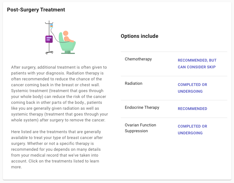
Uses vague language to describe the level of necessity for each treatment category
Lacks signifier to indicate you can click into each category to view specific options

Uses a numerical scale + visual to describe the level of necessity for each treatment category
Card plus bottom right arrow act as signifiers that you can click into the category
Conclusion #3
Patients want a visual road-map of what is to come so that they can picture the next couple years of their life
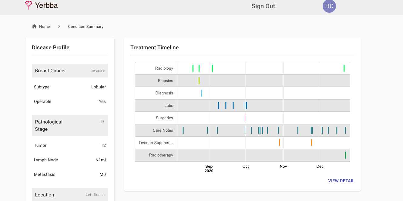
Provides historical treatment events, many of which are too small to affect the bigger picture

Provides an overview of what the treatment journey will look like
Navigation
Optimizing for Web and Mobile
Web and mobile devices have very different navigational patterns. Because we needed the Yerbba Report to be fully responsive, I decided it would be worth it to build separate navigational patterns for web and mobile.

Web: T-Shape
T shape visually differentiates the 1st level from the 2nd level
Collapsible side bar gives users greater sense of control
Overlay gives user’s an escape route from every page

Mobile: Double Horizontal
Dissapearing on scroll-down clears space for the user to absorb content
Appearing when the user scrolls up presents navigation when they may be ready to move on

We were concerned if the horizontal scroll on the second level would be discoverable, but it was in testing
It’s possible users could feel a lack of control when the nav bar automatically appears and reappears
Traditional Mobile Patterns Didn’t Work

Hamburger style made the pages much less discoverable in testing

App style didn’t work because this wasn’t an app. It needed to work on mobile browsers, where the search is now at the bottom
Design Sytem
Establishing some building blocks to go from lo-fi to hi-fi
Once I had some general wire frames ironed out, I felt the need for a basic design system. This would speed up further iteration and lock in a visual style to give us a feel for what this would actually look like. I couldn’t afford to spend months or even weeks on it, so I focused on the basics.
Re-purposing existing colors

I added different shades of each color to use for depth and backgrounds

I used the 60/30/10 split to apply colors to the interface in a balanced way

Adapting Google’s Material UI to feel softer for a caring health app

I rounded out corners on buttons and containers for a less sharp feel

I used mixed-case to make buttons feel less commanding

Making stock icons feel high quality by ...

Customizing the colors with shades of our brand color

Selecting icons of similar style
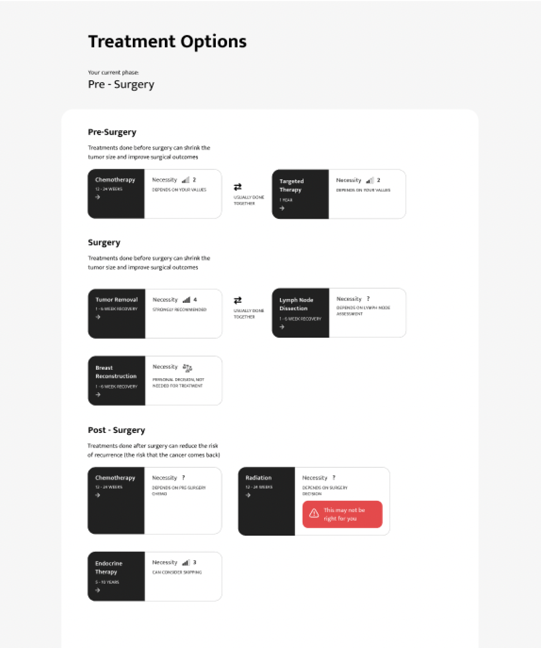
Treatment Categories
Painting the Bigger Picture
We found in our initial research that breast cancer patients want a way to visualize what the next few years of their lives will look like. So they can start to think about work and family and the ripple effects of their diagnosis. But creating this visual was easier said then done. There was a lot of abstract information that needed to be conveyed.
Why put resources into this?

Marketing needed a visualization that could be used to communicate the value of the product at a glance

Patients were frustrated by how difficult it is to visualize the next couple years of their lives. Without this birds eye view, they struggle to answer life’s most basic questions:

Getting Feedback
After some difficult ideation to fit all of the information into one visual, we realized that our ideas were becoming quite coded. We needed to find out if these visualizations made any sense to people outside of the project.

5 participants through UserBrain

Each participant was asked to interpret each of the three visualizations
Each participant was asked which they like best and why
Too Complicated
Took testers a long time to decipher these, if they were able to at all, which lead to frustration
Made people feel like they were back in science class


Just Right
Straightforward approach was understood immediately
Still enough visuals for good scannability
Still has a sense of directional time without putting it on a confusing chart
Final Version
After much iterating to clean up the design and several rounds of testing with the full prototype, here’s how the final version turned out


Key Insight
What matters most to breast cancer patients for the content of the report is ease of understanding
Treatment Options
Providing a hook to increase discoverability
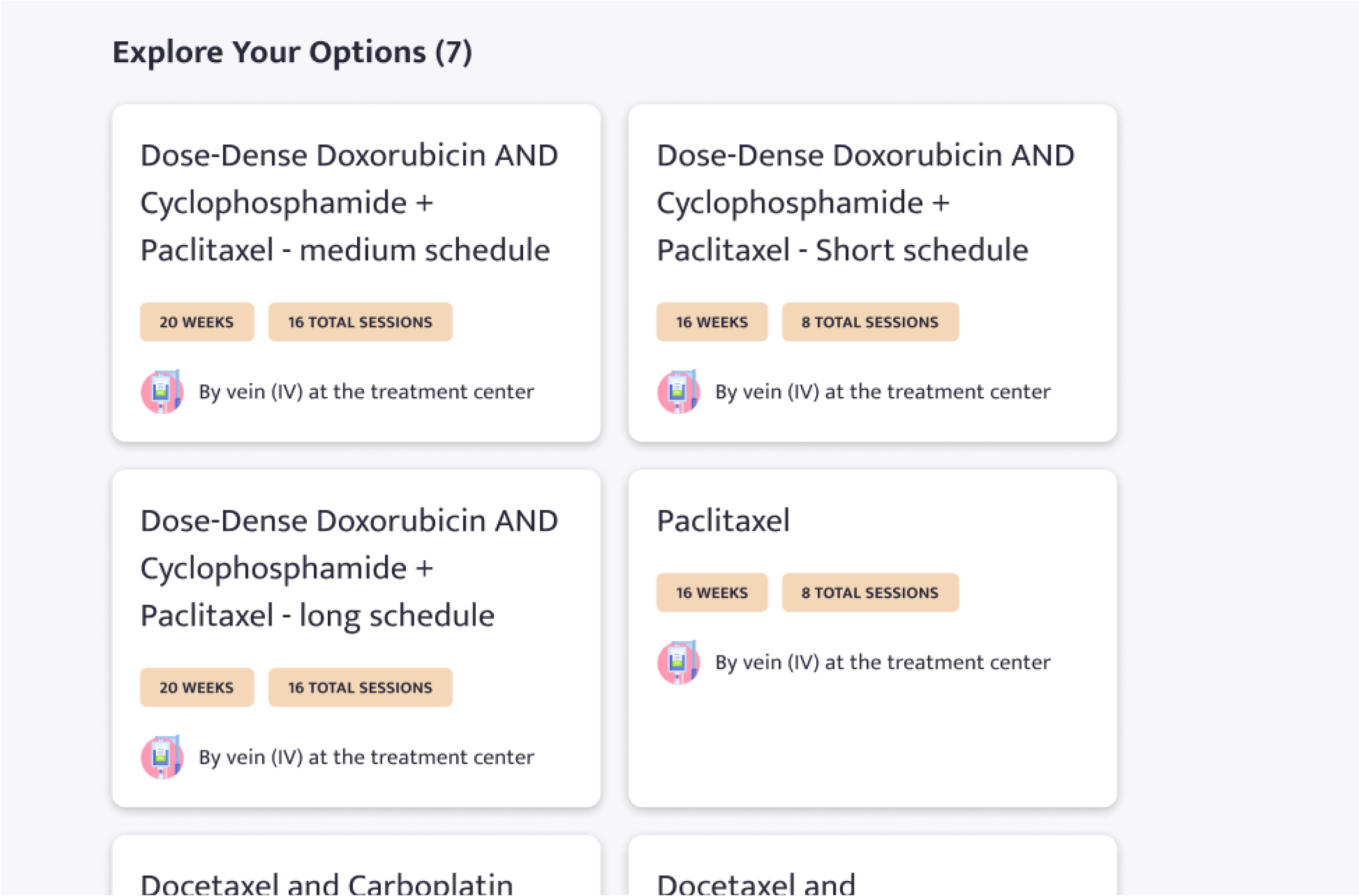
When a user decides to do chemotherapy, the decision making process is not over. Each regimen of chemotherapy has its own pros and cons. Some may be more aggressive in killing the cancer, but bring harsh side effects. Others might be less aggressive but allow the patient to have a higher quality of life while in treatment. This is true for all of the treatment categories. These “inner-option”, as I called them, were like little nuggets of gold for our users. But getting them to dig up these nuggets when they didn’t know they existed was easier said then done.
Why does discoverability of treatment options matter?
In early testing, users often had their aha moment when they eventually found these inner-options. It opens their mind to a whole layer of decision making they didn’t know they had options for.
We had a ton of valuable content for each inner-option, including pros, cons, schedule, common questions, etc
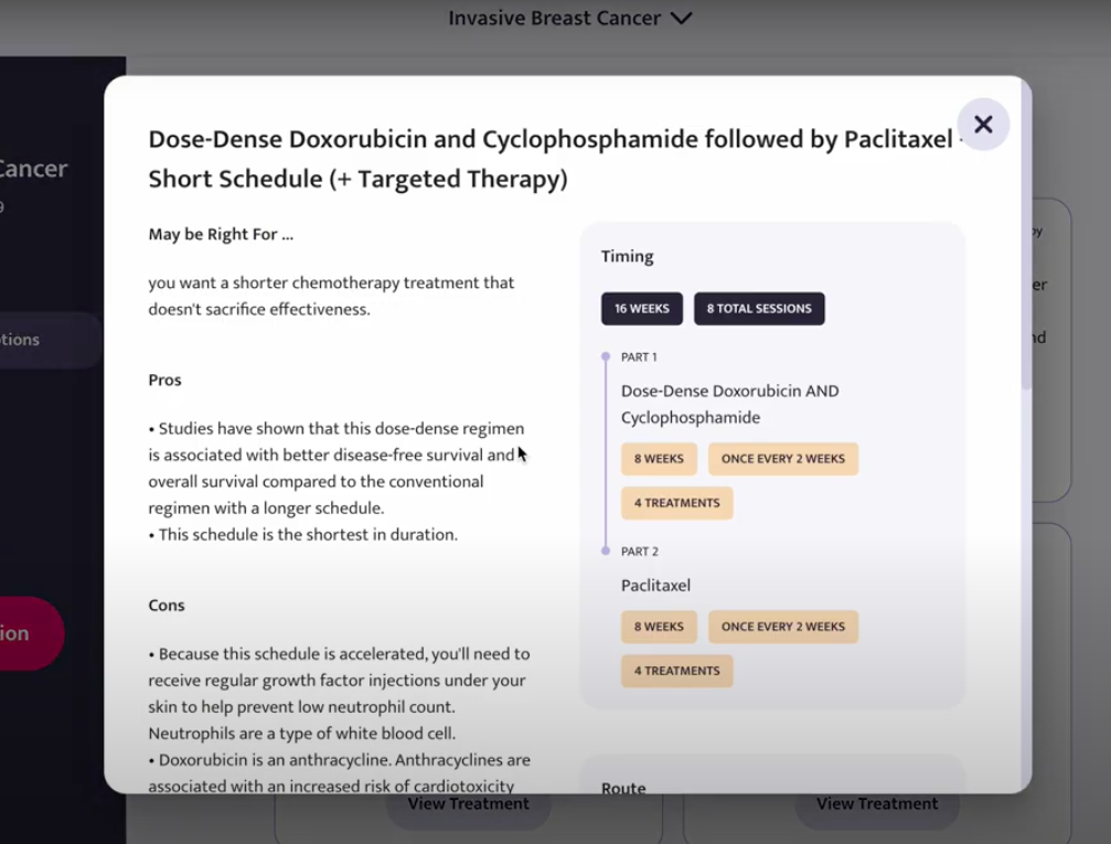
Inner treatment option modal I designed in the final product that I needed to make discoverable
First attempt -> No one clicks
Breast cancer patients did not anticipate that each option would have so much information and no one had the instinct to click on the cards
No hook to give people a reason to click
Each option is identified by an impossible-to-remember scientific name
Very hard to compare options. Would have to open and close modals, remembering info about the previous option you looked at
No CTA on cards to signify clickability
Adding a hook + way to compare
After a lot of staring at the wall willing a solution to come to me, as well as several rounds of testing, I eventually came up with a solution that turned this feature into the star of the report.
Hook by “might be for you if..”
Each option is identified by its biggest advantage instead of its long, scientific name
Easy to compare options attribute-by-attribute by clicking between the tabs
CTA to signify clickability

Key Insight
Since breast cancer patients don’t know what information they should be getting, the interface needs to lead them
Testing
Ironing out the wrinkles
Once I had each feature designed, I wanted to test the product as one being. By the time I had run 4 cycles of testing and improving on my fully dynamic prototype, the product was ready for developer hand-off (which was to myself).
Building a Dynamic Prototype
At the time, Figma had not released their dynamic prototyping features. So I found an alternative.
In the span of three weeks, I learned how to use Protopie to store variables and create dynamic flows. This was important because I wanted testers to feel like they were actually using the product. For example, when they submitted a question in the Ask Yerbba feature, I wanted them to go and find where that question lives in the report.
Testing Web and Mobile
I did 3 rounds of testing with a mobile prototype and 1 round with a web prototype. These tests consisted of three types of tasks.

Explore - First I told each tester to freely explore their report. I wanted to see what they would discover naturally without being directed by tasks.

Find - I asked testers to find certain bits of information that would be important to breast cancer patients.

Perform - I also asked testers to perform actions in the report, such as saving action items or thinking of a question they have and submitting it.

For each round I took notes on the UserBrain recordings, and then grouped the notes to create themes
Launch
The Yerbba Report was launched in Feb 2024 with mixed results
Following the 6 month design process, it took me about 8 months to develop the front-end. 6 to code the product itself and then another 2 to layer on the pricing system on top. I learned a lot in this process about how designs transfer to code, what makes a good handoff, and how misteps in the design process can slow down development.
Unfortunately, I never got to see how this product was received by a large community of users. At the time of launch, our marketing campaign was far from ready. However we did have a small trickle of users coming in from our Youtube Channel and what we saw from them was positive.

Roughly 50% of users who got their free preview ended up purchasing their full report

Users that purchased their report stayed engaged for weeks after
We received hundreds of submissions through the “Ask Yerbba” feature from users engaging with their report
Learnings
My First End-to-End, real-world product
This was my first chance to design and build a real product from research to launch. As you’d expect, I made a lot of mistakes and learned a ton along the way.
Document every decision along the way
While I wrote out the pros and cons for each design, I rarely documented the ultimate decisions that we ended up making and why.
Several months would go by and my boss would ask me “Why did we decide this?” and I would be scrambling for an answer. Documenting these decisions would’ve plugged costly knowledge leaks.
Treat your Figma as a communication tool
Because I was working as a solo designer, I didn’t put much thought into how I organized my work. It was just for me right?
But every time I closed my laptop with a rats nest of frames, I made it harder on my future self. I made it harder on my boss when sharing my screen during meetings. I made it harder on our marketer who couldn’t use my Figma as an information source. In the future, I need to treat my Figma as a design project in itself.
“Pretty much hi-fi” is not “hi-fi”
In the process of development, I found many small details that I didn’t have designed. For example, how certain components were supposed to adjust to mobile or what the hover state of a card is.
Making these design decisions on the fly was costly because it led me down random design rabbit holes. Is a design every truly hi-fi? I don’t know, but mine certainly could’ve been closer.
Think twice before relying on modals
It’s always tempting to use a modal. You don’t have add any navigation to the structure of the product. The user can get back to what they were doing easily.
But with every increasing degree of complexity, modals become a less viable option. They limit the space available and navigation between multiple pages within a modal can become a major headache.
Build user personas at the beginning
A standard step that I missed in my design process. While I had a general sense of who my users were, I found it harder and harder to remember as the process dragged on.
Taking some time to formally define what my users value would have made decisions down the road easier to make.
Test designs with every possible scenario
When I handed off my design to myself, I knew that it worked for most scenarios. However, because I didn’t methodically test out every single type of content, there were a couple scenarios that broke the design.
Because of this oversight, I had to spend valuable time re-doing a few of the designs when I was supposed to be in the development process.
Next Up
Check out another case study
AI Manual Review Tool
Creating an efficient, flexible tool for manually reviewing AI-generated breast cancer reports