

AI Manual Review Tool
A 2-year journey to create a flexible and efficient user-management system
@Yerbba, 2022 - 2024
mission

Create an internal tool for the Yerbba Team to review and approve AI-generated breast cancer reports
Flexible ~ set of actions to account for unpredictable AI results

Efficient ~ flow to get reports out the door quickly and maximize the chances of converting each user

Visibile ~ system status to give reviewer every scrap of information needed to make decisions
My Role
Sole researcher. Conduct stakeholder interviews with CEO to map out reviewer journey. Listen. Question.
Sole designer. Ideate, wireframe, and present
Sole front-end developer. Determine back-end requirements. Convert designs to code. Adjust design details on the fly as needed.
The Problem
Building the behind-the-scenes
While we hoped that our AI would eventually be good enough to trust its results, early versions were prone to errors due to inconsistencies in medical records and the uniqueness of each user. We needed a solution for manually reviewing the results of the AI, both for brand-new reports and updated reports.

How a Yerbba Report gets approved for a new user

How a Yerbba Report gets updated for an existing user

Constraints
Minimizing spend, maximizing impact
Designing a complex internal tool could easily turn into a time suck. We used it every day so we were constantly reminded of its limitations. But we couldn’t let it become our number one priority.
Limited time to spend on internal tools

Our main focus in these two years was launching the Yerbba Report. Only a team of four, we couldn’t let internal tool development take over.

I used short sprints of iteration to make consistent improvements without drawing too much focus.
I cut down time spent on aesthetics, design system, onboarding, hi-fi wireframes, and prototyping. Things that didn’t matter as much for an internal tool.
Designing for an evolving reviewer journey
We were constantly discovering new needs for the reviewing process, requiring new features and flows.
I placed high value on maintainability of both the design tools and the codebase so that it was easy to pick up and put down.
Designing for unknown reviewers
During development, our CEO was the only reviewer. But we hoped to have more reviewers in the future, who wouldn’t have the same intuitive feel for how our internal systems work.
I used my designs to create a mental model of how the underlying structure works.
I safeguarded against critical errors by carefully disabling select actions if certain conditions weren’t met.
The Process
We were the users
The process was pretty simple. After the initial version, my CEO would use the Manual Review Tool to review and approve breast cancer reports. Over time, issues with the tool would naturally rise to the surface, kick-starting a round of improvements. We repeated this cycle several times in two years, in between sprints on the consumer-facing Yerbba Report.


Discovery #1
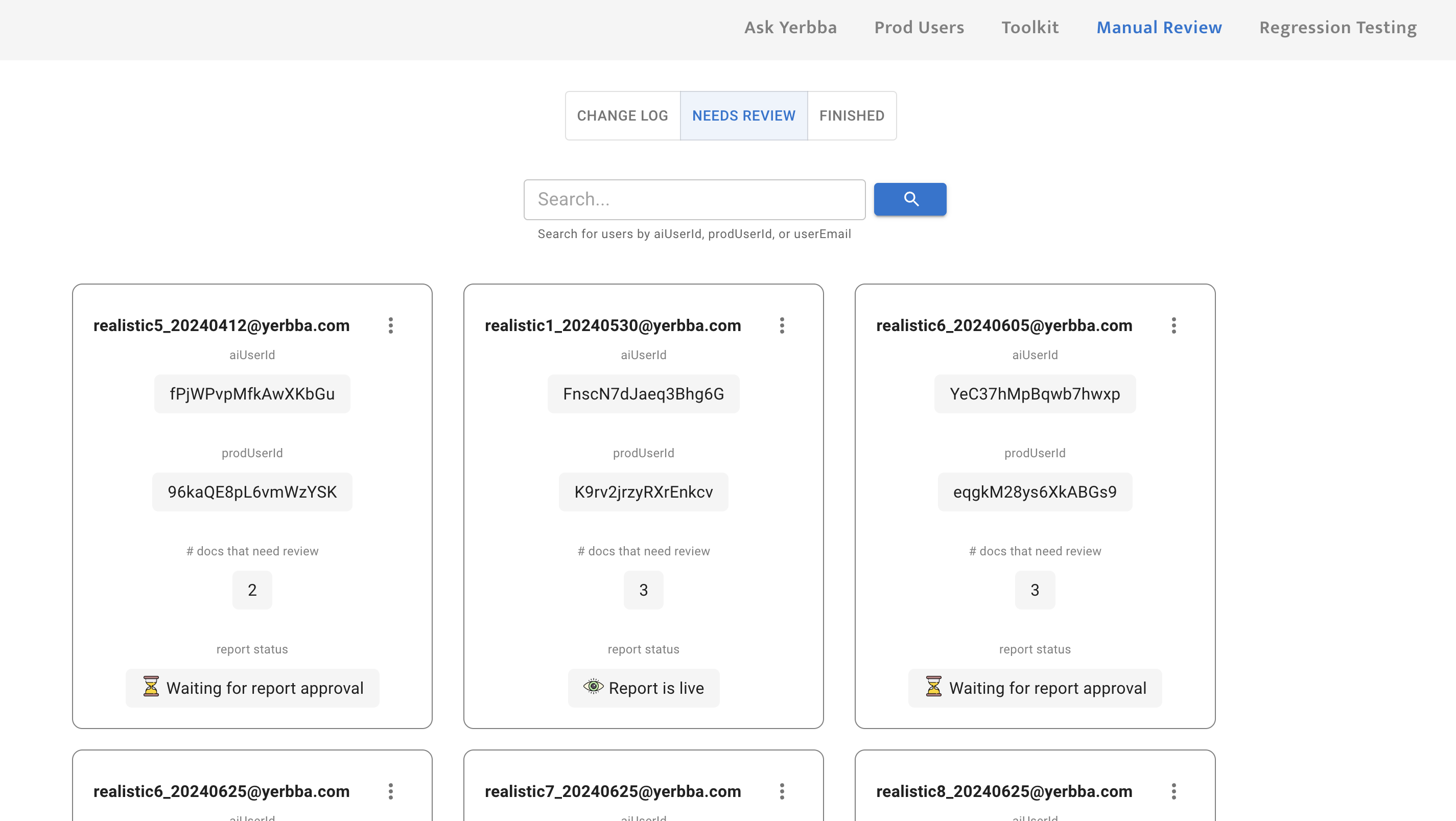
Organizing by users is more useful than organizing by reports
At first our goal for this tool was simply to review and approve reports. So the backbone of the architecture was organized by reports.
But after launching The Yerbba Report in Feb 2024, we realized that we were missing a fundamental layer of user management beneath the report management.

My first design that organized by individual reports

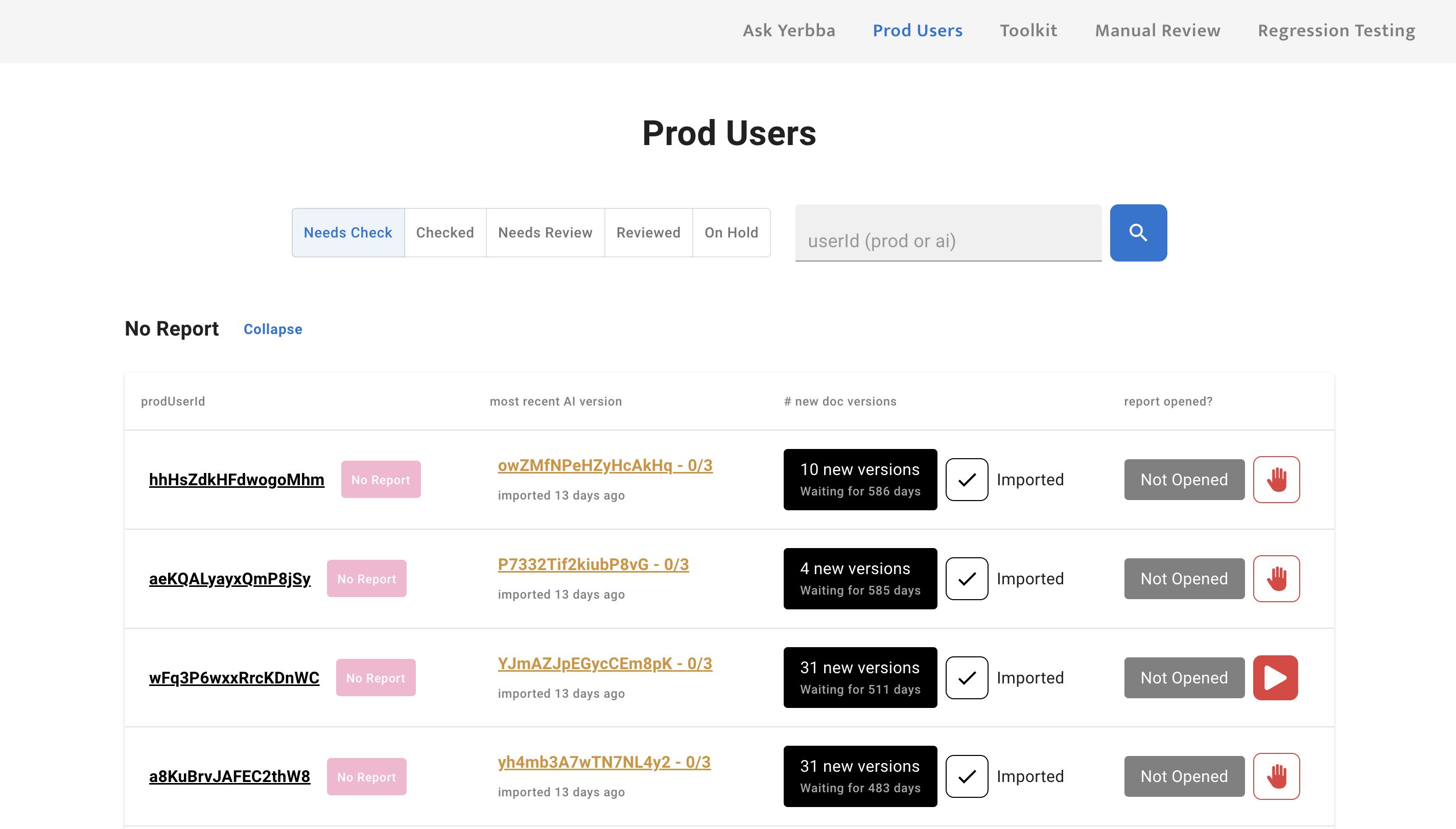
My updated design that organizes by users
Prioritizing users
New Reports > Reports with Updates ~ New reports mean that we have a potential for a new sale. Users with a new report are stuck on an accuracy check screen until their report has been reviewed at least one time. Every second that they are kept waiting reduces the chance that we will convert them into a customer.
Paid User > Free Preview User ~ A paid user is paying a subscription fee to keep their report updated. Whereas, a free preview user has already received their initial report and likely decided not to purchase it.
Users with multiple reports
Although rare, a user with multiple breast cancer diagnosis will have multiple reports. This is an important thing for the reviewer to know in order to have a complete picture of the person that they’re reviewing a report for.
Putting users on hold
When a user fails to convert to a customer after receiving their free preview, it is no longer worth it to keep their report updated. These users needed to be “put on hold”, meaning they would be excluded from the expensive daily refresh of medical records.
In order to make this consequential judgment call, the reviewer needed a thorough user management view.
Discovery #2
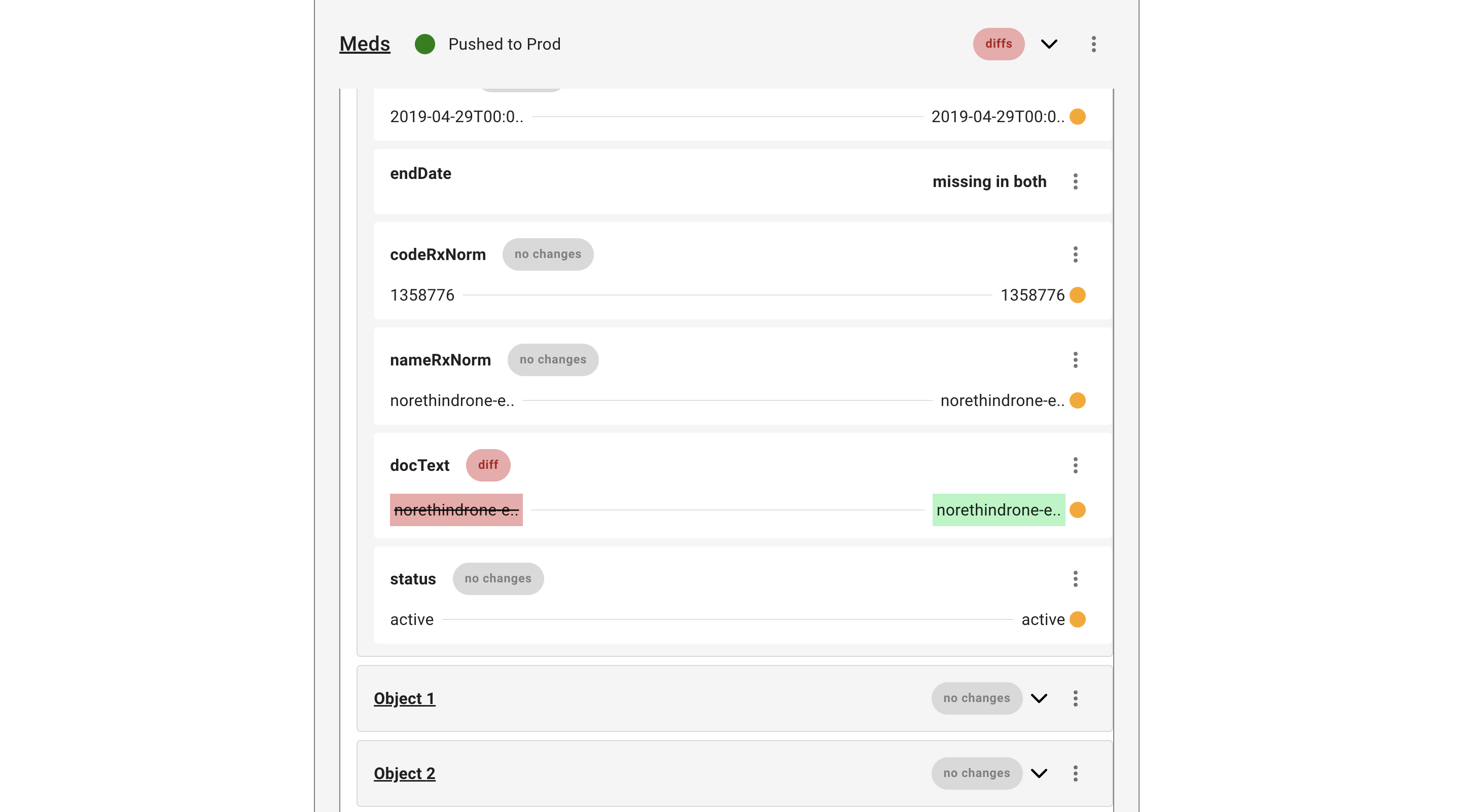
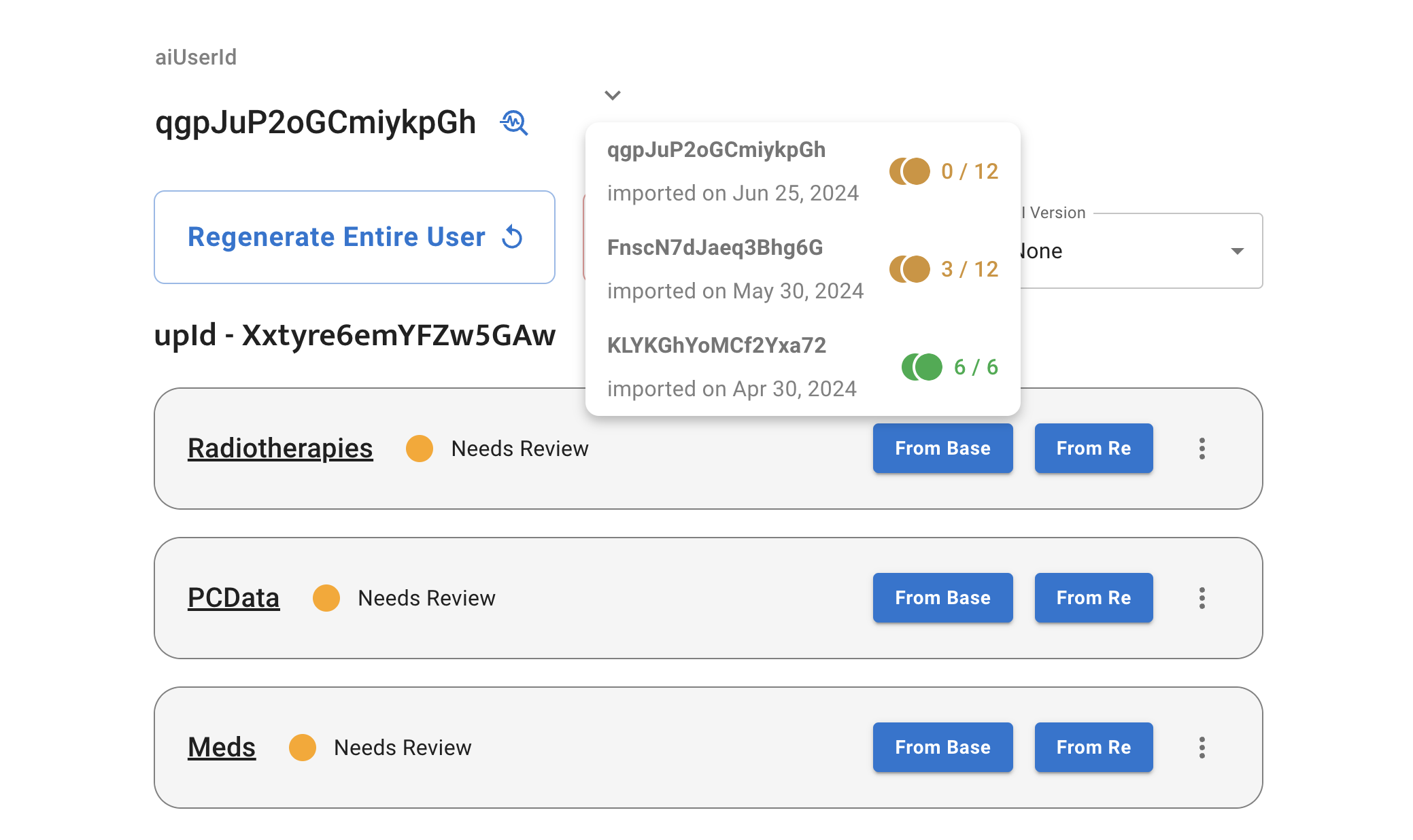
We needed a version control system for medical records
When a user’s medical records change, their report is re-generated from scratch, leaving the reviewer wondering - “What’s changed? Where should I focus my attention?”
First, the user selects a previous version of the report
The results from the previous version are layered on top
Diffs are signaled up the tree
Collapsability was important for the reviewer to get an overview of the documents within a report. So parent objects needed to signal if one of their children has differences of not

Time moves from left to right
In the western world, we think of time moving from left to right. So I placed old values from the older version of the report on the left while new values from the current version of the report went on the right.
old_value
new_value
Version control improves efficiency

It directs the reviewers attention like a trail of crumbs, when they are reviewing an updated version of a report

Reviewer can ignore all documents and variables marked with “no changes”
If the AI makes the same mistake it made in the past when re-generating the report, the reviewer can see the previous manual override and apply it to the current version, so they don’t have to figure it out again
Discovery #3
Eliminating Unnecessary Report Generations
A user’s medical record can change for many reasons. Sometimes, it’s critical information that would dramatically affect their Yerbba Report. Say, for example, that someone completed their lumpectomy. The post-treatment options in that person’s report could look a lot different knowing the results of the surgery.
Other times, however, the change could be as small as a routine flu shot, having no effect on their Yerbba Report. In these cases, it is very wasteful to re-generate a report.
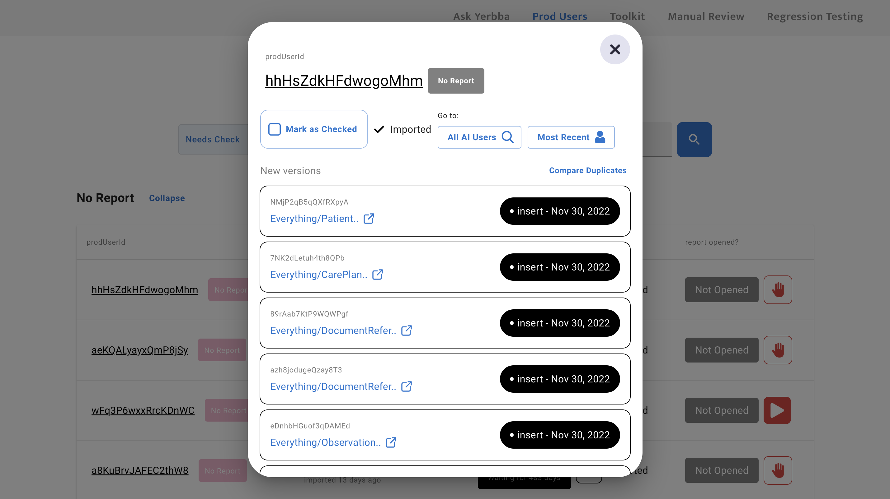
1. Reviewer sees a user with new medical records
# of days waiting helps them prioritize
# of new versions already gives them a hint as to whether it’s a small update or large update
2. Reviewer opens the user’s list of records
Can open the raw text of every individual medical record
“Insert” or “Update” tag lets reviewer know if the document is brand new or an updated version of one that already existed
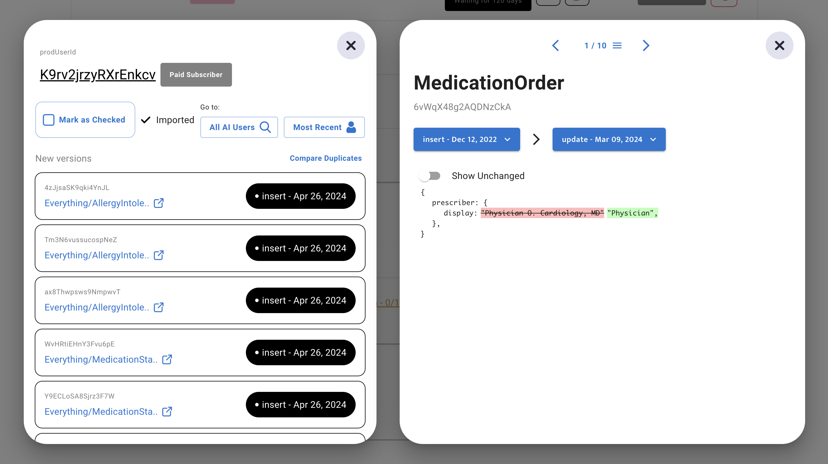
3. Reviewer compares all new versions with their previous version
All medical records with diffs are automatically pulled up for reviewer to click through
By default, unchanged parts of the medical record are hidden but reviewer can toggle them on if they need more context
4. Reviewer generates new version of report only if changes are significant
If they deem the changes significant, they click “Re-generate Report”
Then they mark the user as “checked”, which moves all “new” document versions to “old”
Results
After two years, I had designed and built a dynamic tool to manually review Yerbba Reports
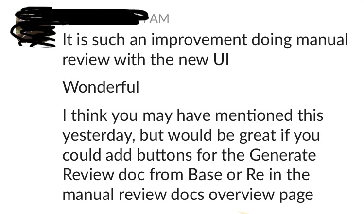
Message from CEO after one of the major improvements to the tool. Since the CEO was the only one doing manual reviews, the only measure of success I had was his feedback. And there was always more to improve!
Learnings
The most complex product I’ve ever designed
The complexity I wrangled along the way for this internal tool was staggering. It was a journey full of twists, turns, bumps, and back-tracks that sharpened my critical thinking skills from a dull butter knife to a razor-sharp katana.
Dig deep in root-cause-analysis as early as possible
I would have saved a lot of time by digging one layer deeper at the very beginning. We assumed that the tool would be structured by reports, and I failed to question this basic structure.
Pivoting to a user-based organization took a lot of our focus after launch that could have been spent monitoring our users and improving the consumer-facing product.
Tools for complex, repetitive work should strive to minimize page switches
Obviously, tools are going to have multiple pages. But once the user is doing the thing that they came to do, you don’t want to make them constantly load different pages. For example, once you open up a Figma board, you don’t have to load a new page to work on one of your wireframes. In my designs for this tool, the manual reviewer has to do a lot of going back and forth between a review and the page containing the reviews.
But every time I closed my laptop with a rats nest of frames, I made it harder on my future self. I made it harder on my boss when sharing my screen during meetings. I made it harder on our marketer who couldn’t use my Figma as an information source. In the future, I need to treat my Figma as a design project in itself.
Tools for unpredictable work should be as flexible as possible
There are some user flows that can be linear. In a sign up flow, for example, everyone follows mostly the same steps. A complex tool like this, though, has an infinite number of possibilities. The AI could make a thousand different mistakes. A user’s medical records could be updated for a thousand different reasons. Which means the journey for the manual reviewer could look different every time. But I was still designing it with that linear, assembly-line way of thinking.
As a result, the experience was a bit rigid at first. Many of our changes over the years were geared towards more flexibility. For example, being able to see all of the variables within a document when you’re looking at the list of documents. Not just when you click into each document.
Next Up
Check out another case study
EHR Sign Up
Creating a trustworthy sign up flow that encourages patients to give access to their electronic health records